|
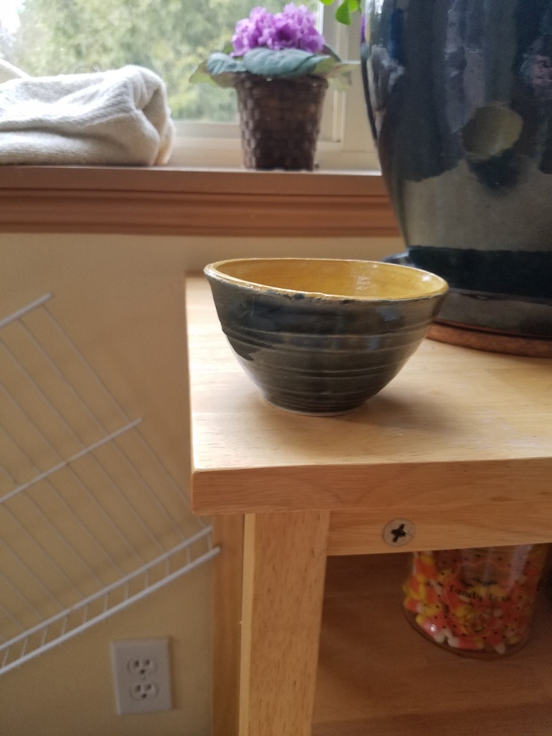
this is the second bowl i made. for the out side i used forest cobalt and rue tile on the inside. i think the contrast between the two colors is really lovely and the outsides lines give the final product movement. the inside is also a little speckled with brown and this gives it a rough looking texture. this project gives off a Mexican house in the summer vibe. i don't know why the colors make me think about this but they do and its a really nice warm feeling.
0 Comments
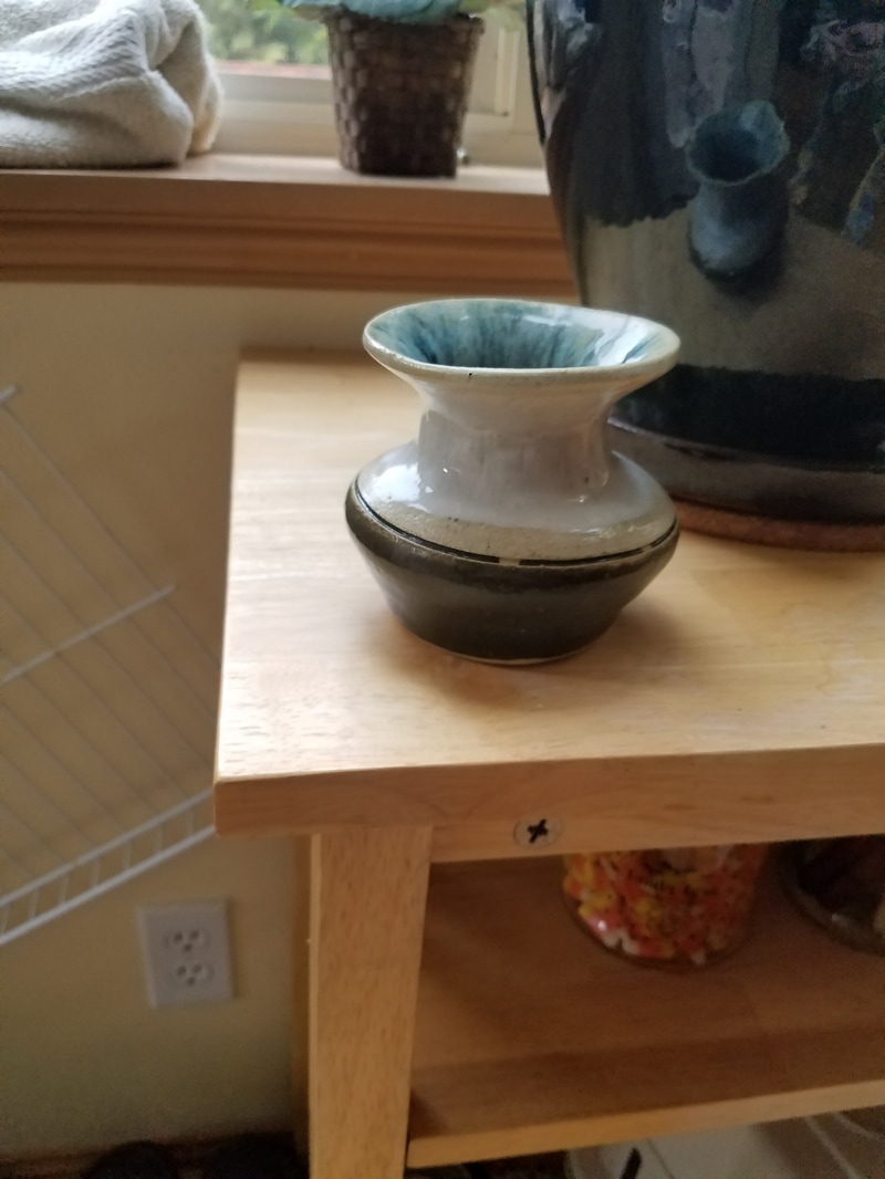
what was supposed to be my tall vase turned out to be a small vase hardly capable of holding more than a dandelion. standing at four inches tall and three wide, it's shamefully footed and the line in the middle is lopsided. the neck has small tick marks although the white somewhat covers them up. the inside is a mix of white and whatever was in the copper bucket of glaze. the bottom half is also what was in the copper glaze bucket and to me looks bland. this was a really fun project to make because i got to make a more complicated creation than just a bowl. i also experimented with outer designs with the lines on the outside. a lot of my other projects don't have hand made designs. this project also uses texture because there is a rough patch in the middle and the lip has balance because the colors run together. this project gives off the feeling joy because its small and cute and nice to look at.
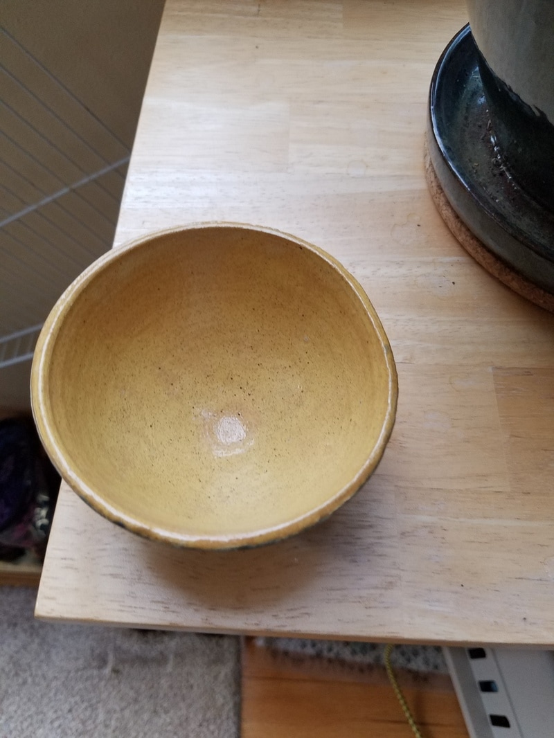
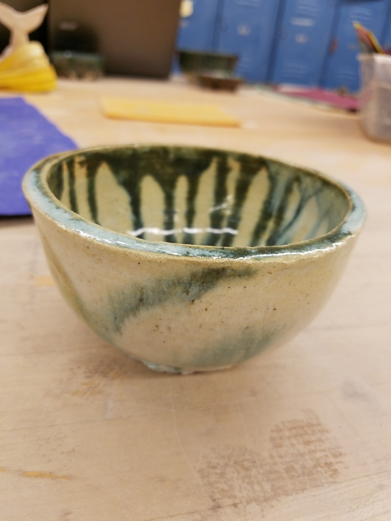
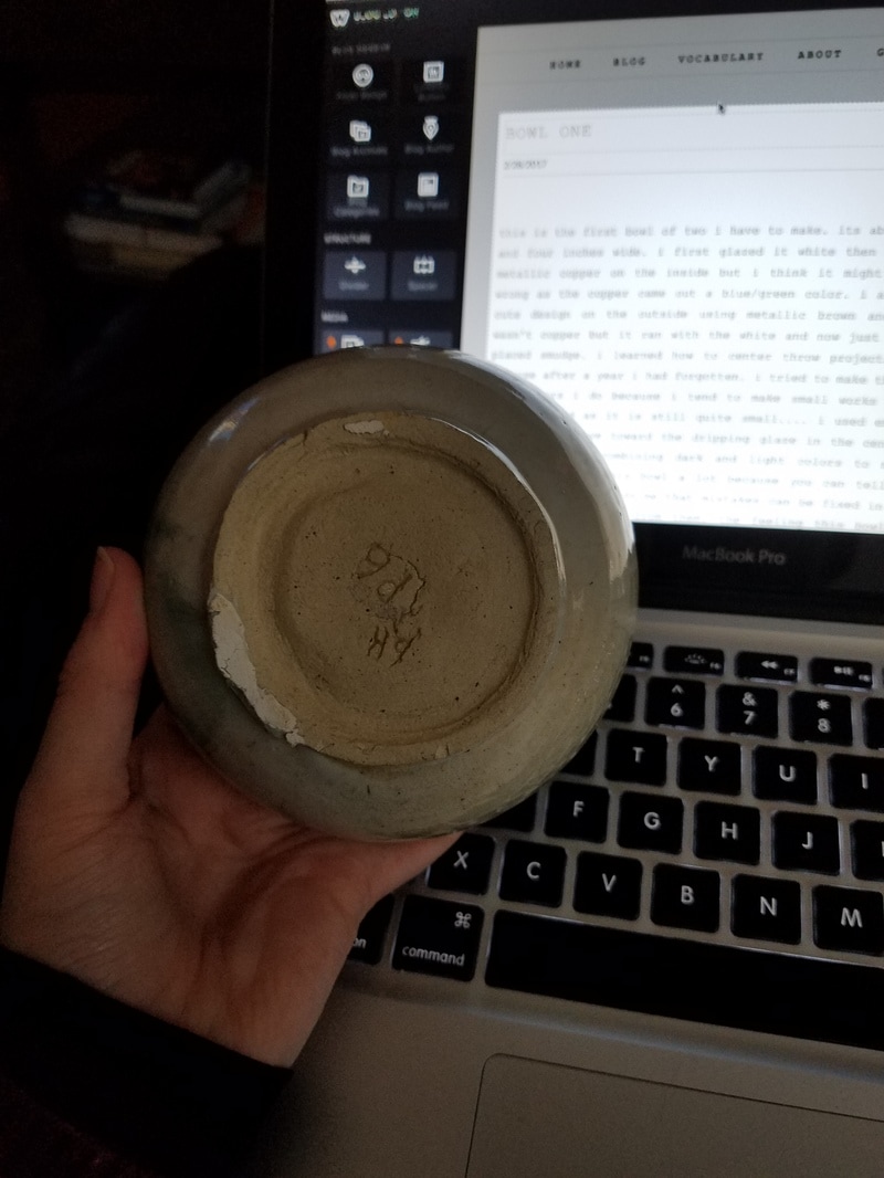
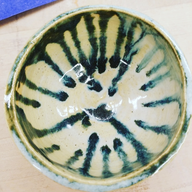
this is the first bowl of two i have to make. its about two inches tall and four inches wide. i first glazed it white then made drips of soft metallic copper on the inside but i think it might have been labeled wrong as the copper came out a blue/green color. i attempted to make a cute design on the outside using metallic brown and the copper that wasn't copper but it ran with the white and now just looks like a well placed smudge. i learned how to center throw projects again with this because after a year i had forgotten. i tried to make this project bigger than others i do because i tend to make small works of art. i didn't quite succeed as it is still quite small.... i used emphasis to direct the observers eye toward the dripping glaze in the center of the bowl, and contrast by combining dark and light colors to make a beautiful creation. i like this bowl a lot because you can tell the bottom was replaced and it reminds me that mistakes can be fixed in art and in life and how we can learn from them. the feeling this bowl gives me is a solemn feeling. like sitting by a fire place in a blanket with hot cocoa and looking out at snow in December.
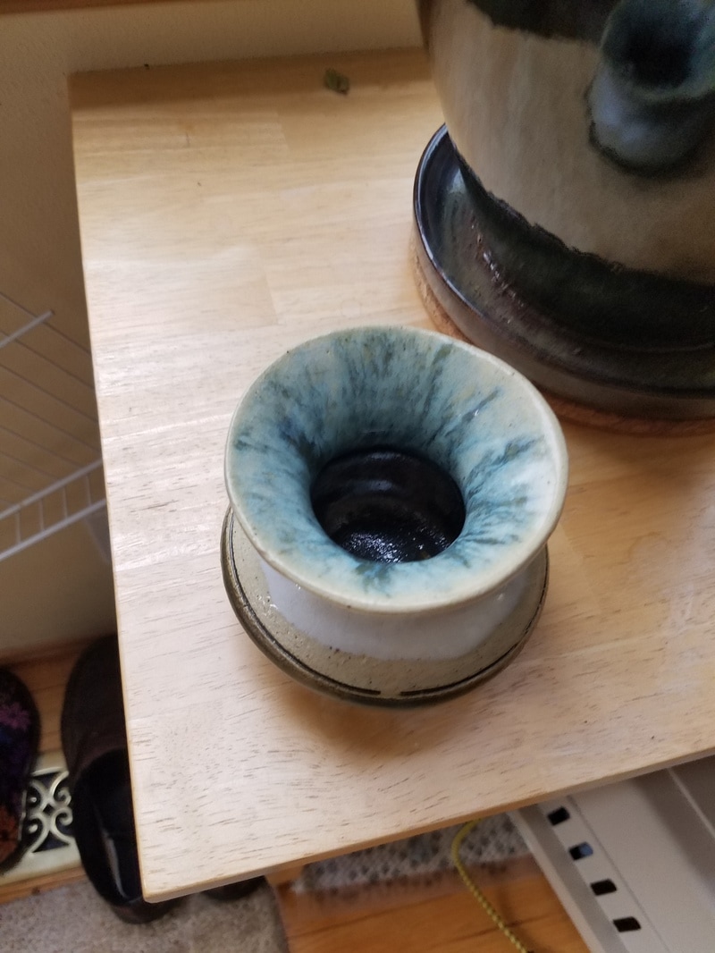
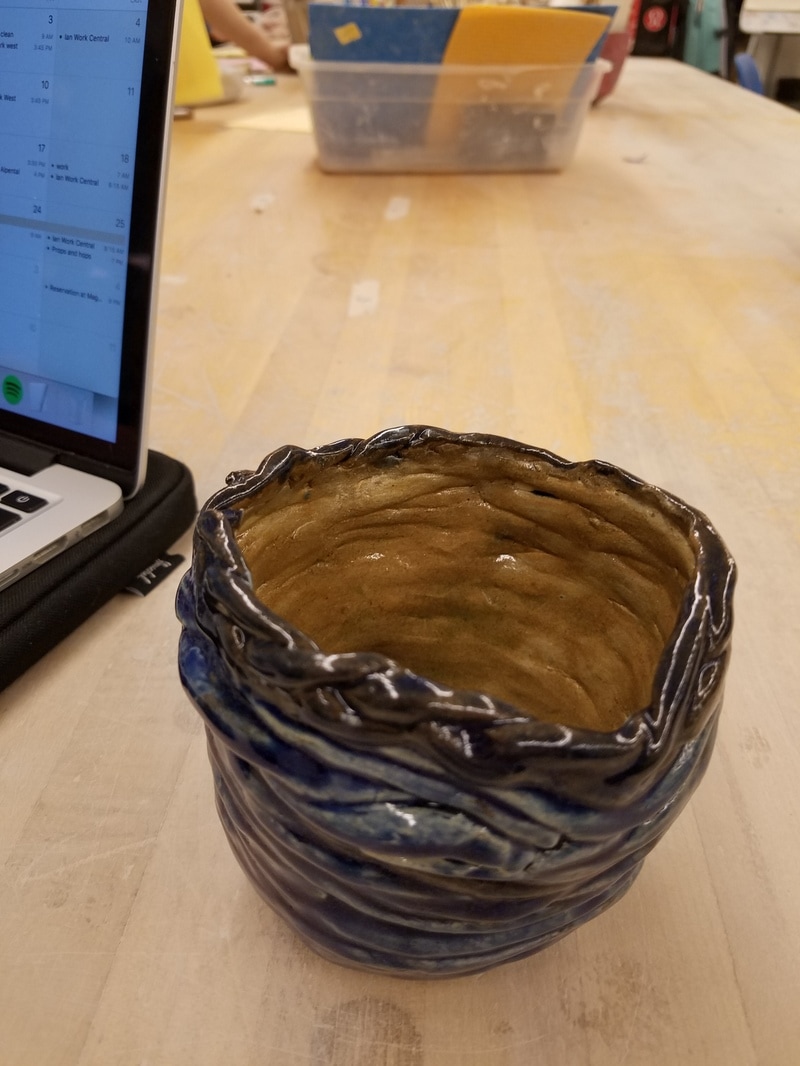
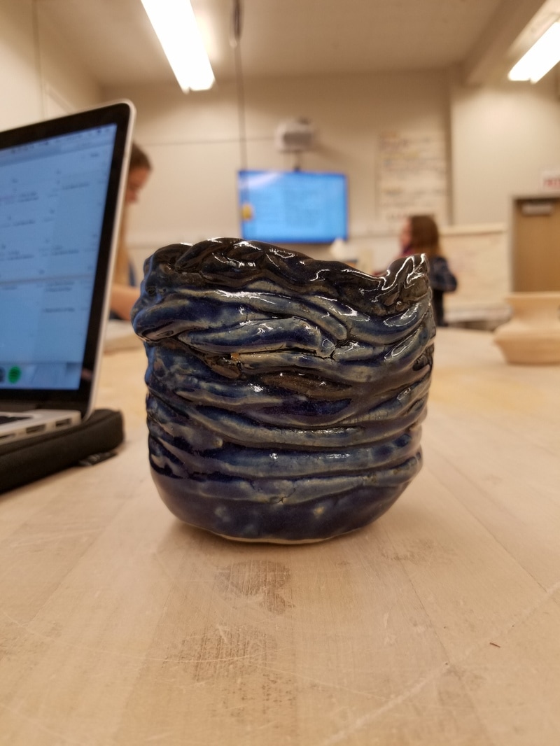
this here is my group coil project. i worked with two lovely girls on this project, one a beginner and one an intermediate like i am. it is for my english teacher Mrs Murphy and had an atom on it but i think that fell off somewhere. we chose an atom because it's a logo for one of her favorite shows the big bang theory. the outside is glazed dark cobalt and the inside rue tile although i thought the rue tile would be much redder than it turned out to be. in this project, an observer can see movement with the way the coils move over and under and across each other. it almost reminds me of the famous painting Starry Night by Vincent Van Gogh just by the way the coils curl around each other. even though this project reminds me of a painting that portrays night, i can't help but think of a stormy ocean when i look at it. i hope Mrs Murphy likes her new pencil holder!
|